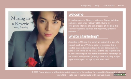
Decided to changed the layout for my fanlisting collective, found a nice little CSS template at Free CSS Layouts and with the help of ColorSchemer to pick out the colors, the new layout was completed within the hour. I had wanted something on the softer and simpler side, quite happy with the results. A single picture of Domyoji-sama was used, he looks absolutely gorgeous here. Love the pose, the single rose and his hair. XO
click on picture to be forwarded to site
Possibly Related Posts:
- Happy Nino Month!!
- Newly acquired fanlisting for Kakashi and Sakura
- Ayase Chihaya and Mashima Taichi fanlisting obtained
- Kise Ryota x Kuroko Tetsuya fanlisting acquired
- New Zoro x Sanji doujinshi and fanfic fanlistings acquired


I know you’re big fan for Arashi!
Can you explain why you love them so much to me?
Heya enkin,
Happy March! Good question and just in time to celebrate my first year anniversary into the fandom. If you’re interested, I had just posted my reasons at
https://sugoi.ws///2009/04/arashi-my-first-year-anniversary-and-reasons-to-the-obsession/ (Beforehand, I want to apologize since it is lengthy. )
~Fiona
now i know why you love them!
i can watch them work hard,too!
嵐 is extremely hardworking group and the friendship between the five members are so close. This make them such a down-to-earth and lovable group. Happy to know another fellow Arashian. Cannot wait to see their Spring dramas – Jun-kun’s Smile, Sho-kun’s The Quiz Show, and Nino’s Door to Door. It’s going to be a wonderful season.